The Architecture Portfolio That Got Me Into My Dream School

The portfolio is one of the most critical aspects of your application when applying to architecture school, but there is a limited amount of information online considering the subject. From my recollection of the college application process last year as a high school senior, the portfolio was one of the most stressful portions of the application, as I had no input on whether I was putting in the right pieces or describing them correctly.
Despite my doubt, I’m writing this article as a current first-year architecture student at the University of Southern California, one of my top choice schools, with a full-tuition trustee scholarship. So, what made my application and portfolio so successful? Within this article, I hope to provide you with the elements that made my architecture school application and portfolio successful.
Below I have provided the complete portfolio I submitted to USC for my application, along with the descriptions I provided of each piece in the additional details section of Slideroom:
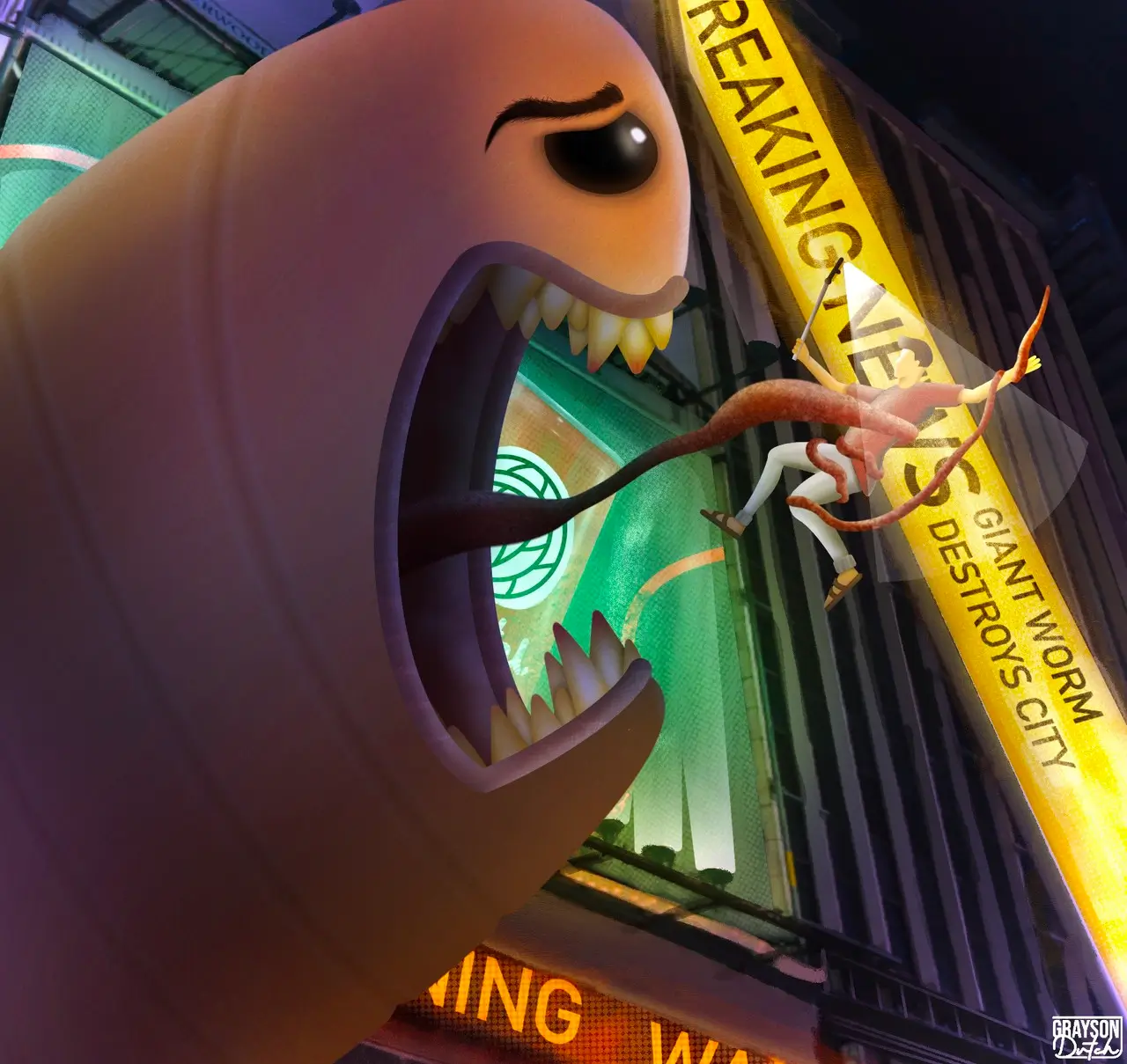
Title: Attack of the Bullworm
Medium: Digital Art, Procreate
Additional Details: This piece depicts The Alaskan Bullworm from Spongebob attacking a city and eating people. I drew inspiration from old horror movies such as Godzilla, King Kong, and Mothra, where a giant monster attacks a city and causes destruction. I put the scene in a modern setting because it would allow me to implement dramatic lighting while still being realistic.
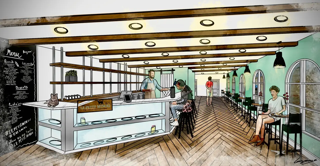
Title: Le Petit Minou
Medium: Digital Art, Procreate
Additional Details: This piece depicts a hand-drawn rendering I did for one of my architectural design projects in downtown Blytheville. My sophomore year, I worked with a local business couple in downtown Blytheville to design a French-themed bakery in the former location of an old hair salon. I created the design in SketchUp first and then exported an interior image of the SketchUp model into Procreate on my iPad. Then I drew the rendering on top of the image to ensure I had the correct perspective and scale. I drew influences for the interior from both French and Southern United States interior design styles. I used barn doors and exposed wood beams to incorporate the Southern influence and the parquet floors for the French influence. The "Le Petit Minou" was something I added to the design to give it a little flair. It means "tiny cat" in French. I envisioned the cafe having a cafe cat that would greet guests.
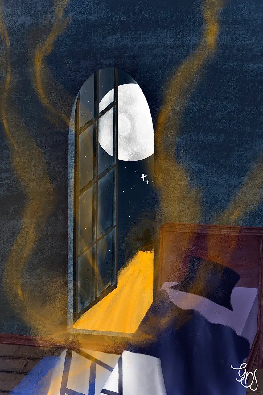
Title: The Golden Evening
Medium: Digital Art, Procreate
Additional Details: Golden Evening was one of the first pieces I did in Procreate after I got my iPad. It depicts a dreamscape, with a girl leaving her bedroom and following a path forged from golden sparkles out of her window. The piece illustrates a dream from an outside perspective.
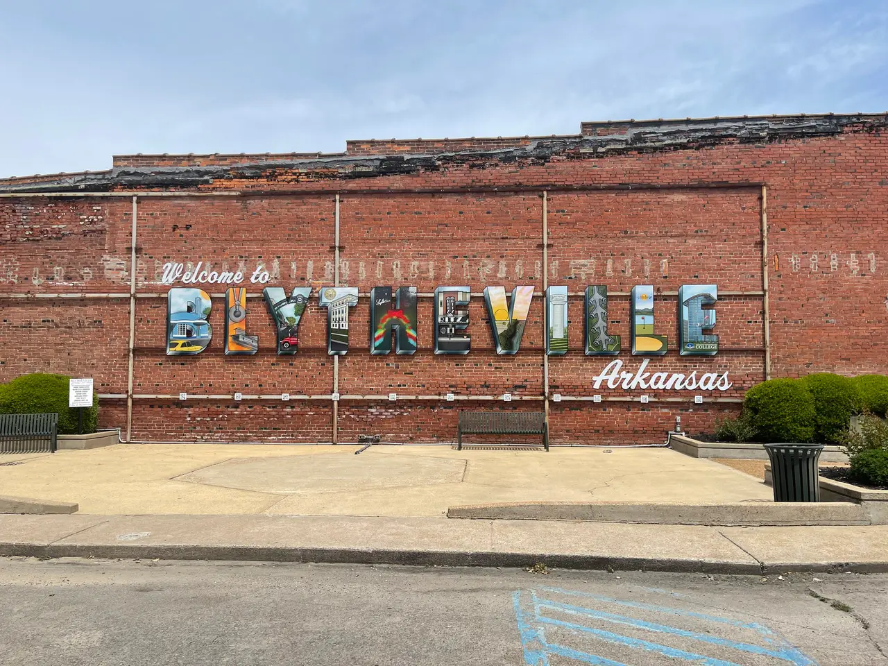
Title: Blytheville Postcard Mural
Medium: Digital art printed onto metal letter, Procreate
Additional Details: I worked with the mayor's office to complete this mural in the former location of a previously removed mural. The concept for the new mural was to make it look like a greeting postcard. My role in the project was creating the artwork depicting local landmarks that a local sign company would print onto each letter. It took me about two months to finish the drawings for all eleven letters. I also created the QR codes, which are under each letter. These QR codes direct visitors to the Google Maps of the landmark depicted on the letter above it when scanned.
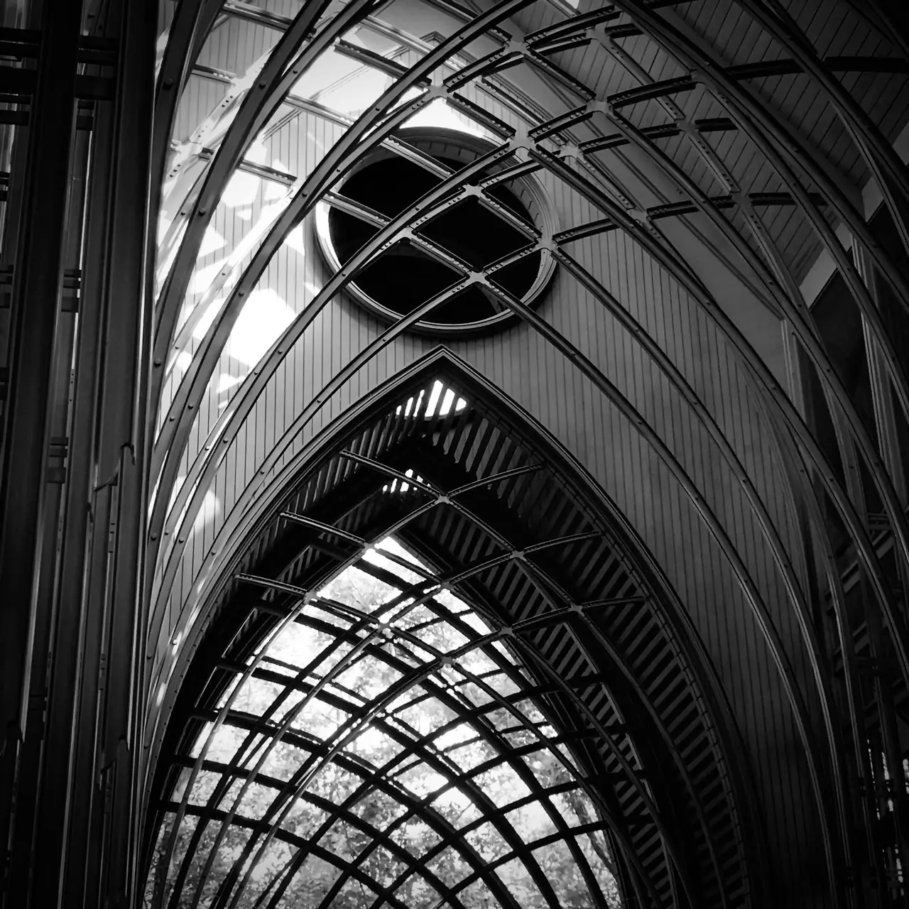
Title: Forged Iron
Medium: Photography
Additional Details: I took this photo at the Mildred B. Cooper Memorial Chapel outside of Bentonville, Arkansas. The chapel was designed by architect Fay Jones. I visited the chapel with a tour group from the Fay Jones Architectural Design Camp, which took place at the University of Arkansas.
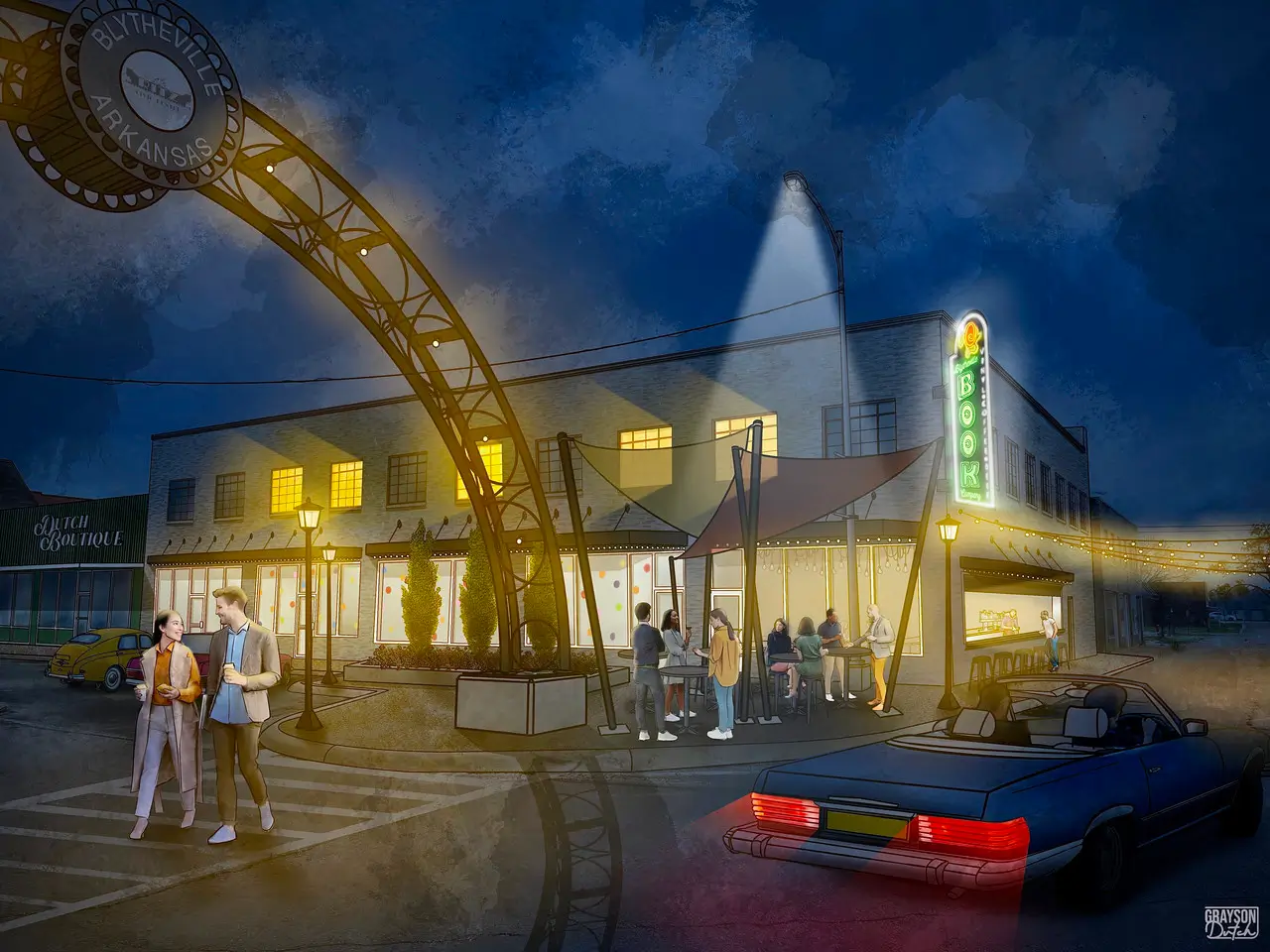
Title: Blytheville Book Company Concept - Night
Medium: Digital Art, Procreate
Additional Details: This is a concept piece for the future of the Blytheville Book Company. The owners needed a physical illustration of the ideas they had for their business to present to local boards for approval. I outlined the structure of the building using a photo I took of the property, then I added the textures and other details. I added color overlays to the daytime render and used airbrush effects with different blending modes to achieve the lighting to achieve the nighttime effect.
The concept included the addition of a restaurant next door with an exterior walkup bar, outdoor shade structures with seating, and a new neon sign. This piece was one of the most time-consuming drawings I have ever done.
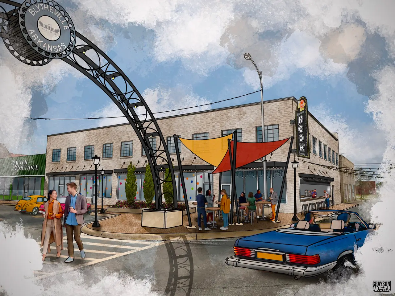
Title: Blytheville Book Company Concept - Day
Medium: Digital Art, Procreate
Additional Details: This is a concept piece for the future of the Blytheville Book Company. The owners needed a physical illustration of the ideas they had for their business to present to local boards for approval. I outlined the structure of the building using a photo I took of the property, then I added the textures and other details. The concept included the addition of a restaurant next door with an exterior walkup bar, outdoor shade structures with seating, and a new neon sign. This piece was one of the most time-consuming drawings I have ever done.
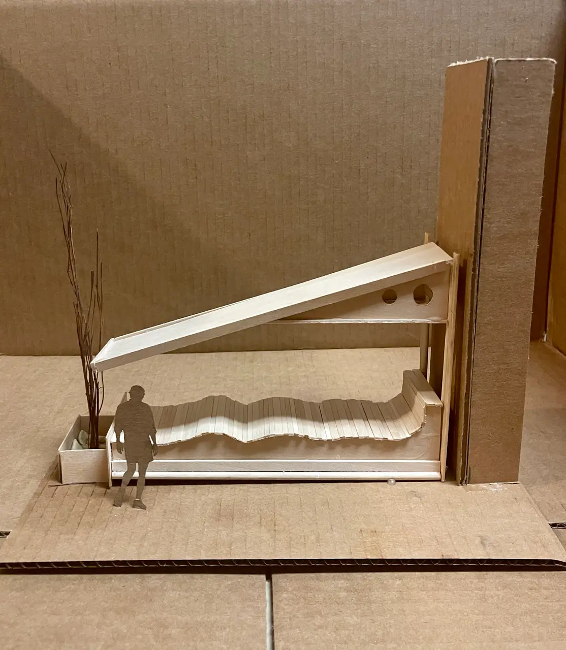
Title: Mid-Century Modern Outdoor Lounge Structure
Medium: Architectural Model; cardboard, wood, and sticks
Additional Details: This was the final project I did for the Fay Jones Architectural Design Camp at the University of Arkansas. We were tasked with creating a seating/lounge area for our assigned area on campus. I decided to create a mid-century modern style structure that extended off one of the columns of the north side of the psychology building. I wanted to make my structure multi-functional, where people could lounge on it and sit on it. To create the wavy surface of the lounge bench, I cut multiple small wooden sticks; realistically, these would be wood planks or boards.
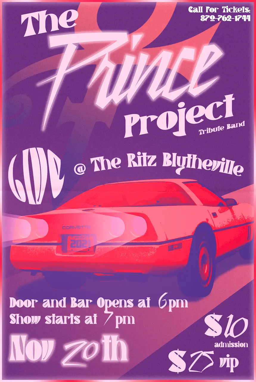
Title: The Prince Project poster
Medium: Graphic Design; Adobe Illustrator, Adobe Photoshop
Additional Details: I completed this poster for The Ritz Blytheville for their upcoming Prince tribute band. I created the design in Adobe Illustrator. I incorporated multiple elements to coordinate with the Prince theme, such as his symbol in the background and the Little Red Corvette. To achieve the effect of the Corvette, I first cut out the image of a Corvette in Photoshop. Then I carried the image into Adobe Illustrator and applied a posterization effect with a gradient map.
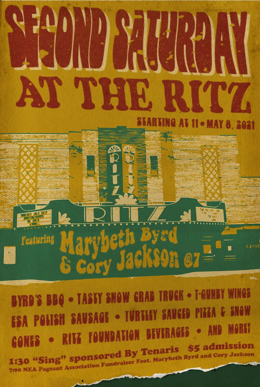
Title: Second Saturday Poster
Medium: Graphic Design; Adobe Illustrator, Adobe Photoshop
Additional Details: This was a poster graphic I created for the Ritz's Second Saturday event in collaboration with Main Street Blytheville. I achieved the effect of the Ritz by expanding an image of the Ritz in Illustrator and then applying a gradient map. I applied the distressed and tear effects in Photoshop after I finished the graphic in Illustrator.
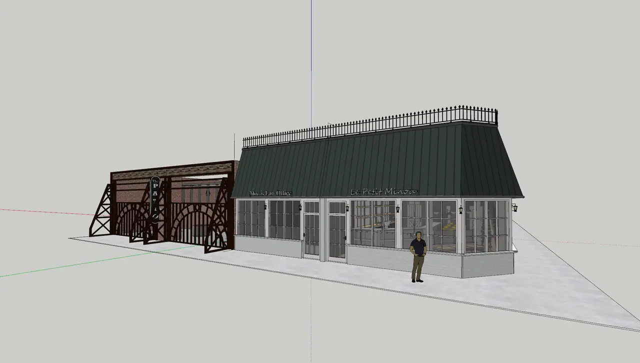
Title: Destination Downtown SketchUp Model
Medium: Architectural Design, SketchUp
Additional Details: This is an image of the exterior of a project I did in SketchUp. The two properties were completed with two different clients, but they are located next to each other in real life, so I did the same in the model. On the left side is Le Petit Minou, a French-style cafe with southern influence in the former location of a hair salon. On the right is The Patio, an industrial-inspired outdoor event center at the former site of a dilapidated building.
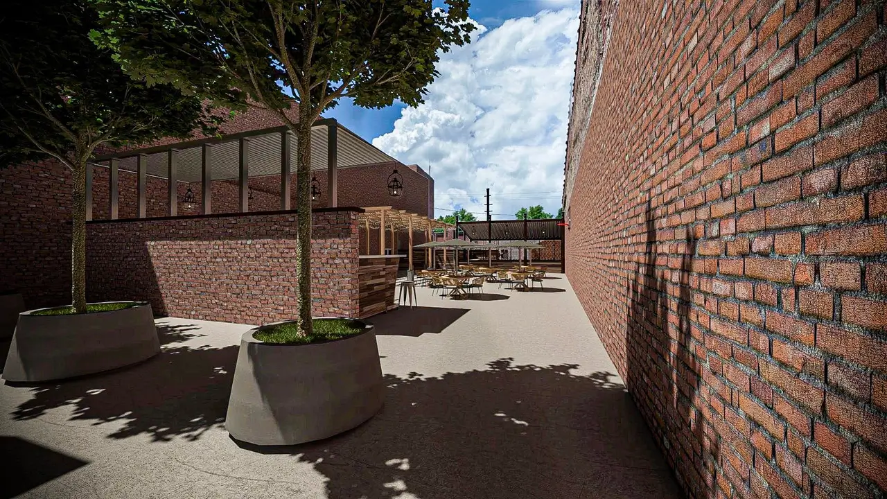
Title: The Patio Interior Render
Medium: Architectural Design, SketchUp, V-Ray
Additional Details: This is a rendering of the inside of The Patio. The Patio was a project I was asked to complete by the mayor's office. The city obtained ownership of the site of a dilapidated building and cleared it. At the site, they wanted to add an outdoor event space. I created the design in SketchUp, drawing industrial influences. I made the space multi-functional, with moving furniture and a rolling bar that could be stored for different events. After finishing the design in SketchUp, I used Vray to create the rendering.
Tips for Creating Your Archetecture Portfolio
1) Be concise and choose your words carefully. Basically, for your additional details section of Slideroom say what needs to be said and get out.
2) Submit high-quality images of your work. Make sure all images are legible, well lit, and on a blank background.
3) Showcase the skills specific to certain programs. As you can see, my portfolio primarily consisted of pieces using computer-aided design software, such as Procreate, SketchUp, Adobe Illustrator, and Adobe Photoshop. This was mainly because I went to a small school that didn't have an art program, so there wasn't an option for me to do a lot of physical art (paintings, pencil, pen & ink, etc.) within school. When I wasn't in school, I didn't want to waste money on materials for physical art when I could do it on the tablet or computer I already had. I provided context for the lack of physical art within the additional information section of the common app. Now I wonder if this hurt my chances because when you read the instructions for the portfolio on the websites of most schools, they recommend not including CAD models, like the ones I did in SketchUp throughout high school. It didn't hurt my chances at USC because I was accepted (and I see now why because it's a very technology-intensive program). However, other schools like Cornell, WashU, and Rice may have used that as a deciding factor when rejecting me because they have more physical drawing-based programs. So consider this when completing your portfolio: your portfolio showcases the skills that best allow you to adapt to specific programs.
4) Make sure that your portfolio tells a story. The last vital thing to consider is the story you are showcasing with your portfolio and what you are trying to portray through the work within it. Your portfolio and application should work together in a cohesive way to tell a singular story or passion.
For example, all my pieces mainly revolved around community involvement and working on architectural revitalization on my town's main street, such as the Downtown Blytheville Mural, the posters for the Ritz Theater, or building revitalization concepts in SketchUp or Procreate. These pieces coincided with what I listed within the activities section of my Common App, as I mainly completed all of the pieces within my portfolio within my extracurriculars.
Your application essays and short answers tie the activities section and portfolio together. For example, my main passion was historic revitalization within architecture, specifically the main streets of rural areas, so I explained how the work I did within my extracurriculars and portfolio coincided with this passion. Now obviously, I know my portfolio isn't a regularity; most high school students don't have the opportunity to work on CAD models in SketchUp redesigning historic buildings in their city, but the premise of cohesiveness between your portfolio, essays, and activities still stands for any circumstance.
Check our our list of Best Schools for Architecture and don't forget to join the CC Community for discussion and support while going through the college application process!